ANY-maze Help > Using ANY-maze > Viewing and analysing results > Viewing results
Viewing results
![]()
Results in ANY-maze can be viewed as text reports, graphs, track plots or heat maps.
| • | Creating a text report |
| • | Creating a graph report |
| • | Creating a track plot or heat map report |
| • | Viewing results reports which are defined in the protocol |
Creating a text report
As their name implies, text reports show the results of an experiment in a textual format. Typically, such reports show one measure grouped by another measure; for example, Test duration grouped by treatment - see figure 1.
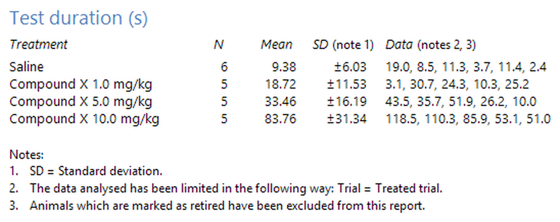
Figure 1. An example text report showing test duration grouped by treatments.
To actually create such a report is very simple.
| 1. | Switch to the Results page. |
| 2. | If it's not already selected, select the Text option in the Report style section of the ribbon bar. |
| 3. | In the list titled Results to include, select the measure, or measures, you would like to analyse. |
| 4. | In the drop-down list titled Group data by, select the measure you want the data grouped by. |
| 5. | Click the |
| 6. | ANY-maze will analyse the results and show the report. |
As you will probably notice, there are other options too - for example, you can choose whether the report will include the standard deviation and/or standard error of the mean of the groups. If you want to return to the report settings to change the options, then you simply need to click ![]() Edit report settings button in the ribbon bar.
Edit report settings button in the ribbon bar.
You'll find full details of exactly what all the report options do in the topic Viewing results as a text report.
Creating a graph report
Graph reports are closely allied to text reports, and in fact the quickest way to create one is to simply change the Report style of a text report to Graph - to do this you just need to click the Graph option in the Report style section of the ribbon bar. The data you were viewing as a text report will simply be redisplayed as a graph - see figure 2.
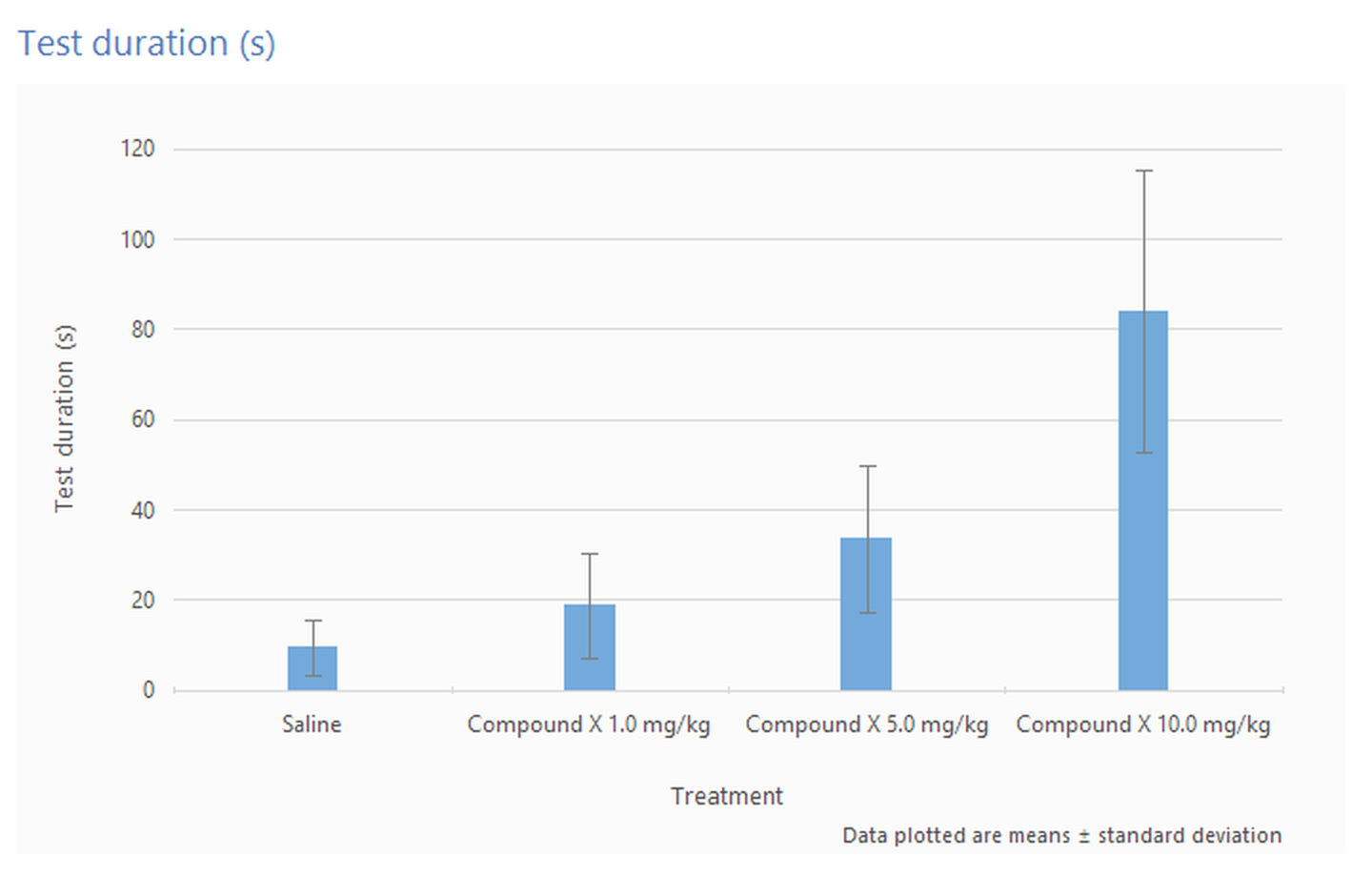
Figure 2. The same data as shown in figure 1, but formatted as a graph.
In fact, this ability to change the style of a report applies to all the styles, and you can change between them at any time.
If you look at the Report settings page for the graph report style (by selecting Graph style and then clicking ![]() Edit report settings button), you will notice that it has some options which weren't available for the text report - for example, graph type (line, column or scatter) and the type of error bars to include.
Edit report settings button), you will notice that it has some options which weren't available for the text report - for example, graph type (line, column or scatter) and the type of error bars to include.
Although I didn't mention it above, you can in fact select more than one grouping measure for a text report; however this facility is most useful in graph reports, as you can use it to plot multiple series. For example, you could create a graph which shows treatment on the x-axis with a different series for sex - see figure 3.
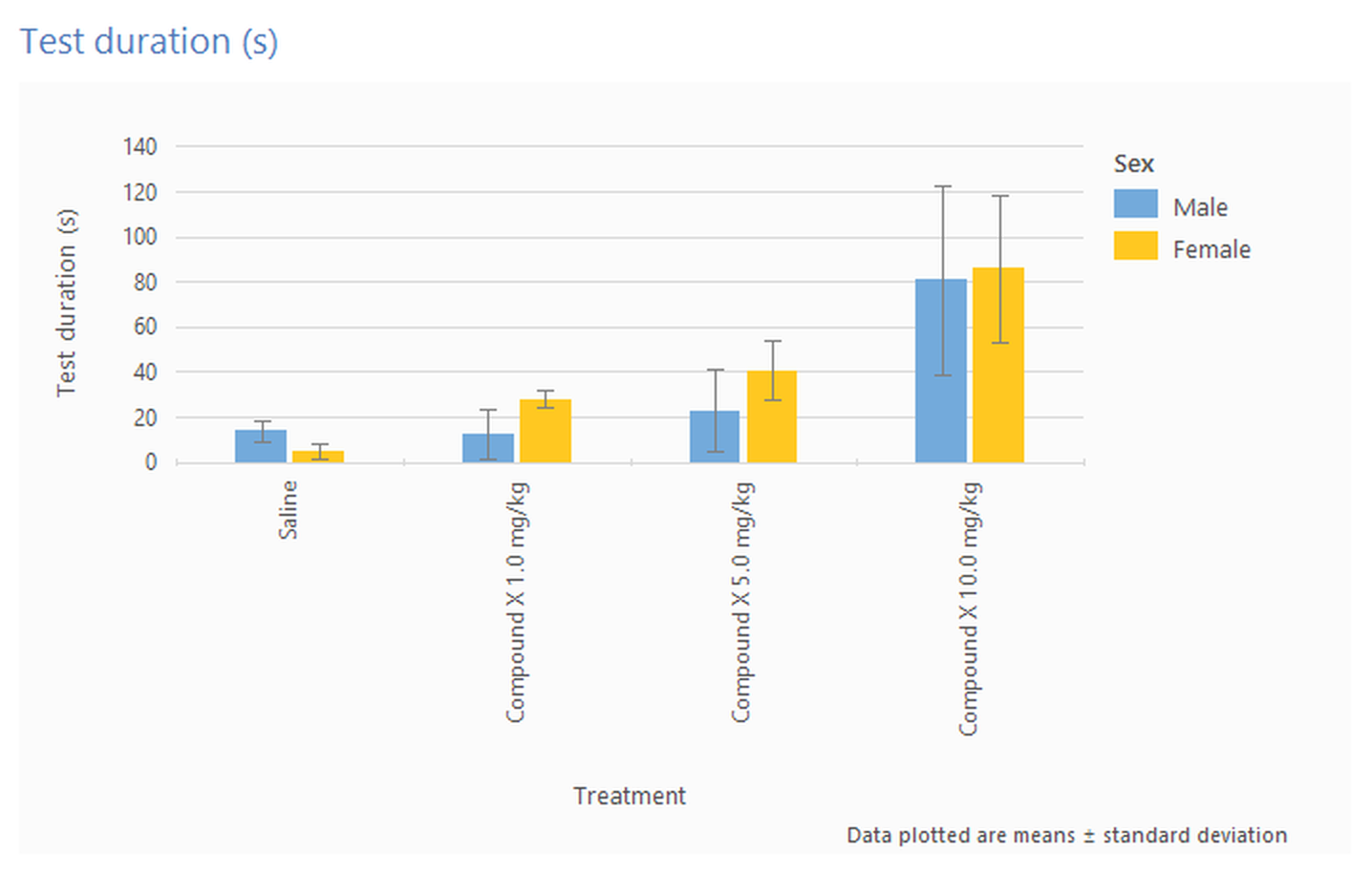
Figure 3. A graph showing different series for Male and Female animals.
Creating a track plot or heat map report
Track plots are surprisingly useful as they can provide a very graphic way to highlight the differences between groups of animals - see figure 4.
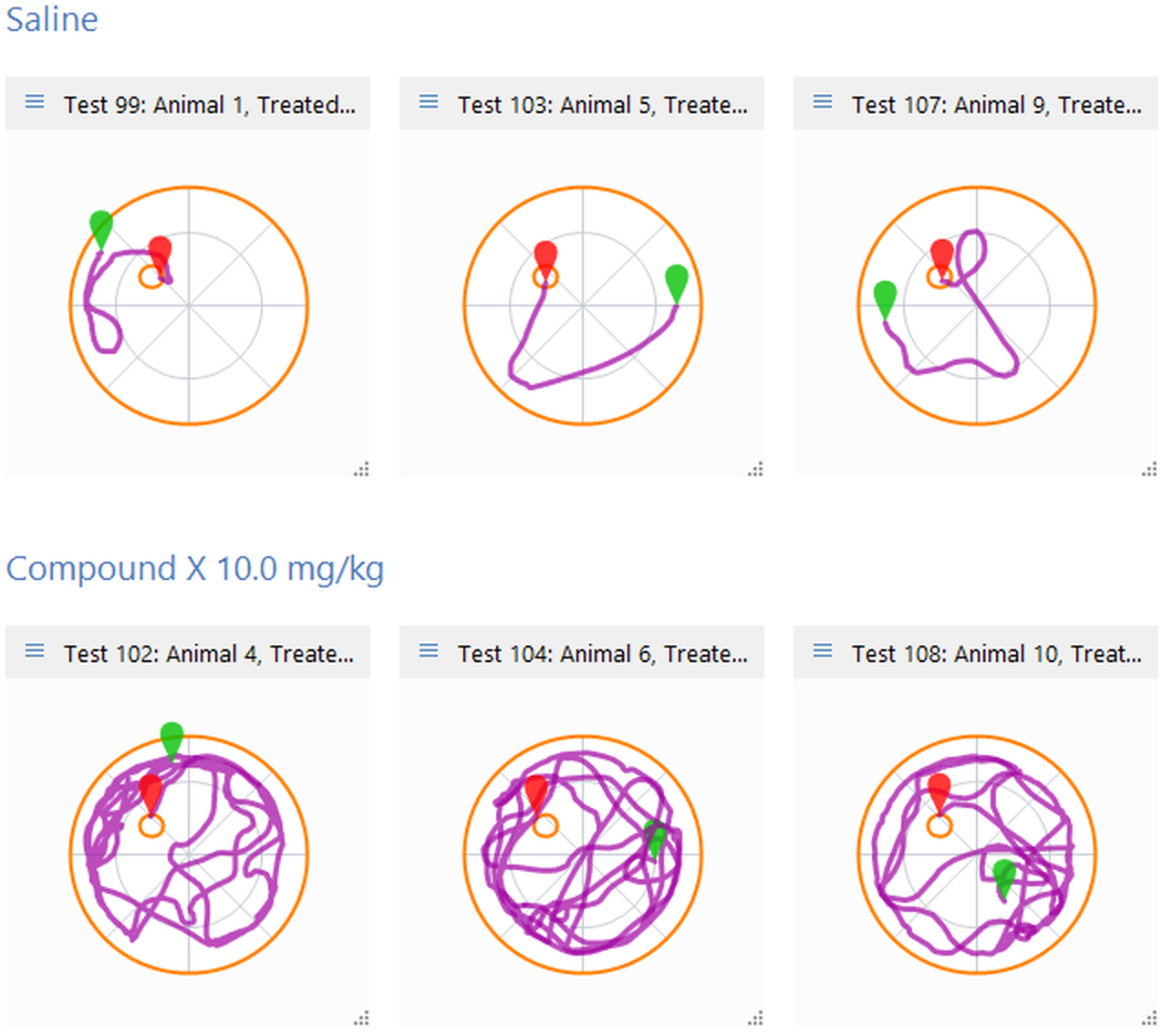
Figure 4. This figure shows some plots from the Saline and Compound X 10.0 mg/kg groups for the data shown in figure 1, and clearly highlights the fact that the treated animals have difficulty finding the water-maze platform.
To create track plots, you simply need to change the report style to Track plot. Again, you can adjust the plots shown by clicking the ![]() Edit report settings button in the Actions section of the ribbon bar.
Edit report settings button in the Actions section of the ribbon bar.
When using the Track plot report style, you have the option to show Heat maps rather than actual plots. Heat maps show where the animals spent the most time during their tests - the more time they spent in an area, the 'hotter' the colour - see figure 5 for an example.
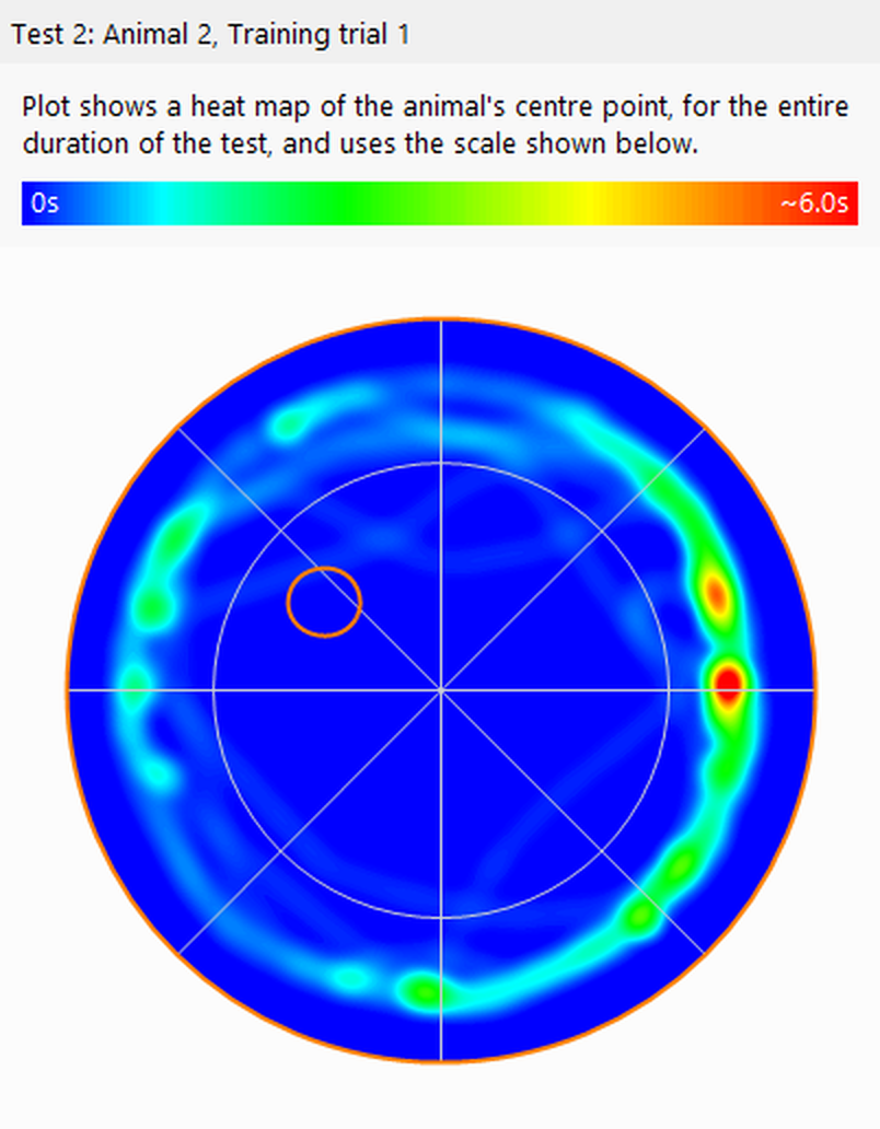
Figure 5. A heat map shows the areas where the animal spent the most time in 'hotter' colours - here it's evident that the animal spent most of the test in close proximity to the walls of the water-maze.
Viewing results reports which are defined in the protocol
As you may know already, it's possible to include definitions of results reports as part of an experiment's protocol.
When a protocol includes one or more such definitions, then the names of the reports will be listed in the Stored reports list in the ribbon bar. Selecting a report from this list will cause the report to be displayed immediately.
As you can imagine, this facility is very useful if you will usually want to view the same results in all experiments based on the same protocol. For example, in plusmaze experiments you may always want to view the results for 'Percentage of time in the open arms'. By including a suitable report definition in the plusmaze protocol, these results would be just one-click away in all your plusmaze experiments.
![]()
© Copyright 2003-2026 Stoelting Co. All rights reserved
ANY-maze help topic T0045