ANY-maze Help > The ANY-maze reference > The Results page > Viewing results as graphs > Specifying how graphs in a graph report should be organised
Specifying how graphs in a graph report should be organised

In brief
You should use the drop-down list labelled On the x-axis show to select what will be shown on the x-axis of your graph. For example, choosing Treatment will cause one column (or point if you use a line graph) to be shown for each of the treatment groups in your experiment.
You can optionally choose to break data into different series and/or across different graphs by making appropriate selections in the other two drop-down lists.
Details
Graphs plot the means of measures for particular groups. At its simplest, a graph will just show the different groups on the x-axis with the measure value on the y-axis - see figure 1.
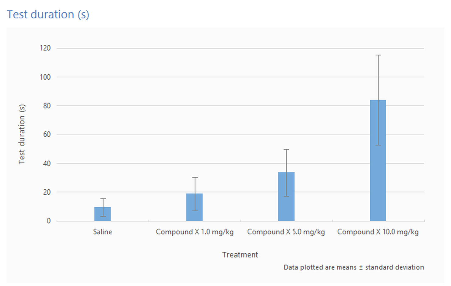
Figure 1. A simple graph showing the mean Test duration for different treatment groups.
However, you might want to split your data into different series too. For example, if your protocol includes multiple stages then you might want to show the stages on the x-axis and show different series for each of the treatment groups - see figure 2.
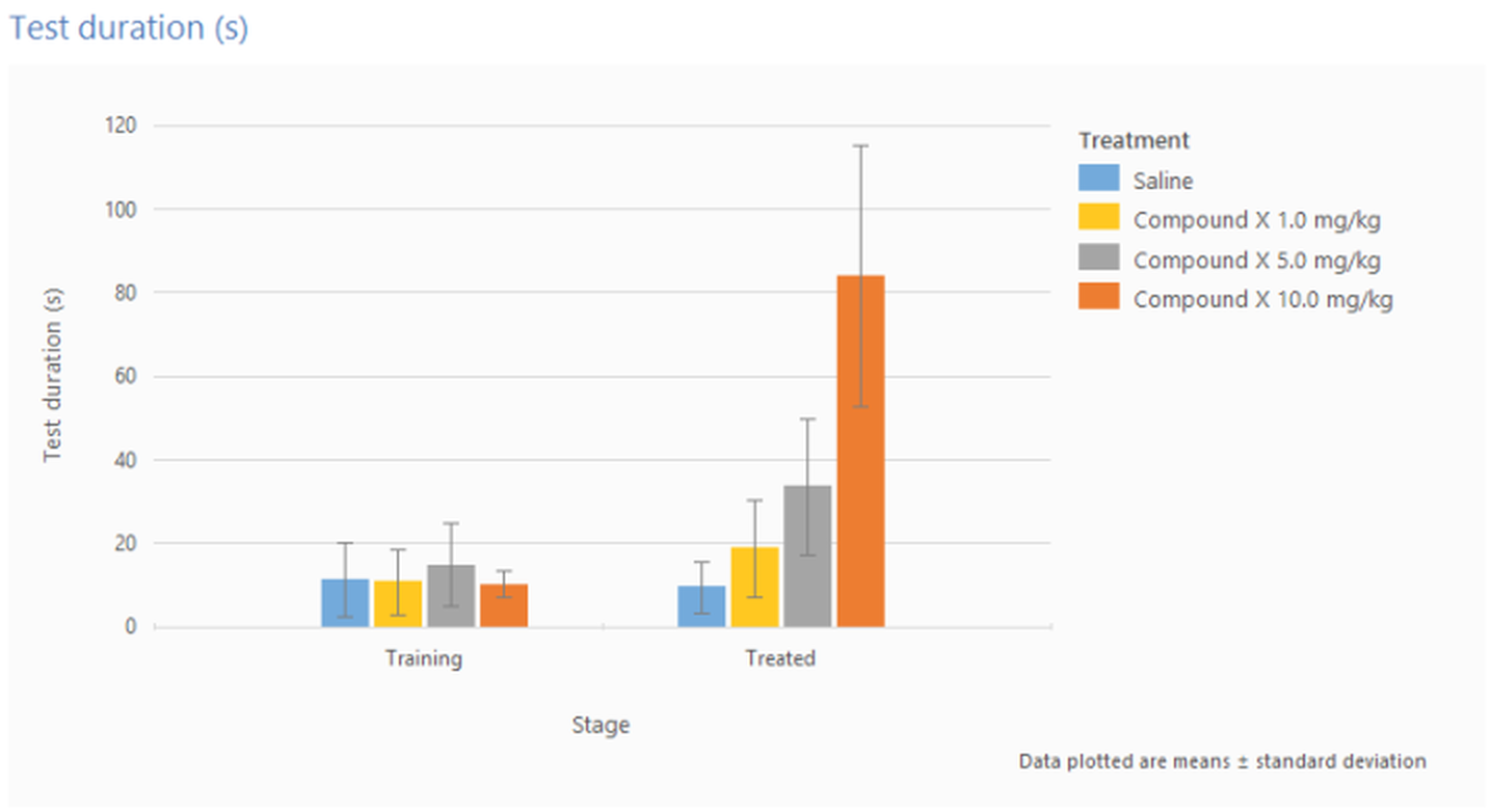
Figure 2. A graph showing the mean Test duration in different stages for different treatment groups.
Alternatively, in this situation, you might prefer to use different graphs, rather than different series on a single graph.
In fact, you can show different graphs and include different series on each of them. For example you might want different graphs for each stage in an experiment, with each graph having a different series for each treatment with the x-axis of each graph showing the different trials in the stage.
The  Clear report settings button in the ribbon bar can be used to reset all the report settings back to their defaults.

© Copyright 2003-2026 Stoelting Co. All rights reserved
ANY-maze help topic T0843